Site Navigation
UX Designer | Angie’s List
Challenge
When using Angie’s List users needed to be able to navigate easily from any point in their journey. At the time there was no global navigation on the visitor’s site and the header on the homepage differed from interior pages. This created confusion for users when trying to quickly find companies to hire or information to research.

User Goals
Intuitively find companies by project type or task from any part of a journey
Find research articles by topic from any part of a journey
Intuitively know where to look for links to pages with the desired information
Business Goals
Design and develop a responsive and consistent global navigational system
Increase SEO value
Direct links to SEO pages from navigation
Provide additional unique content
Increase visits and time on page
Address potentially confusing copy and information architecture
Research
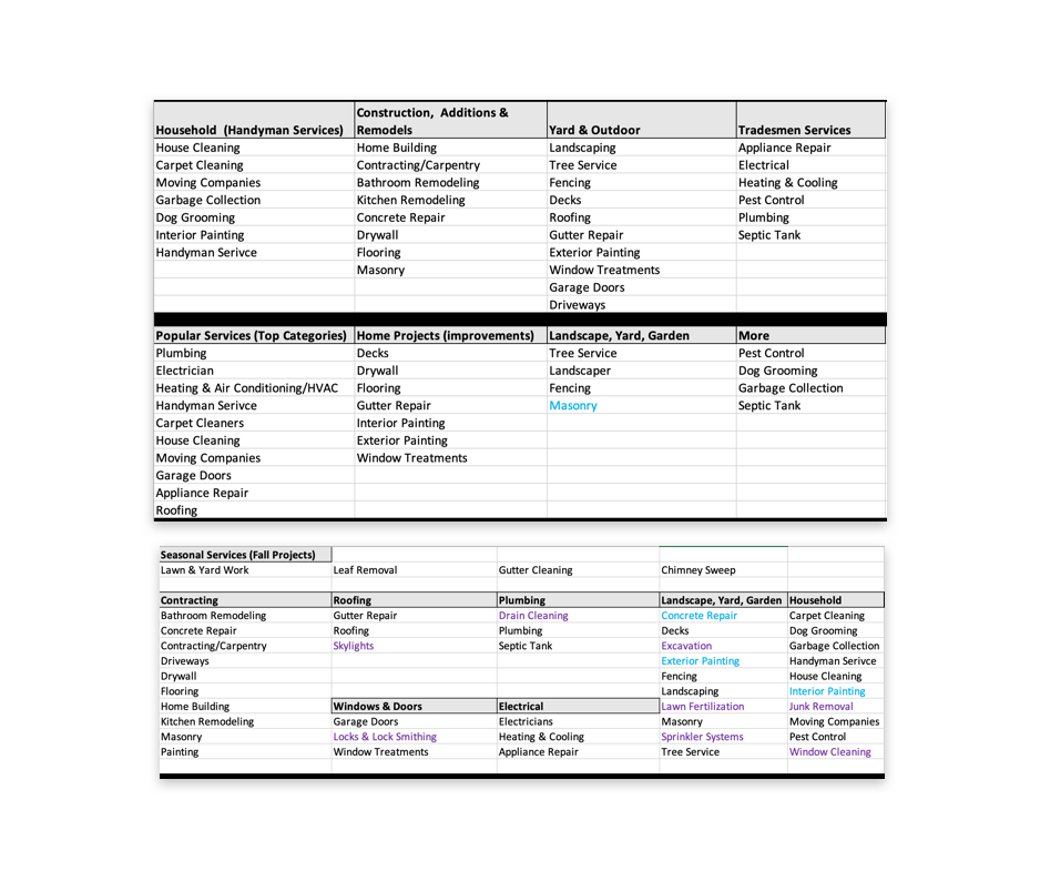
A major portion of this project was determining how to intuitively group links that were required in the navigation. I created a few versions of the groupings to review with stakeholders, realizing we aren’t our users we decided we needed to do further research. I worked with the User Researcher on our team to conduct a remote open card sorting study. The results were heavily consistent with our assumptions with the exception of a few common outliers. We then conducted a closed card sort with pre-named buckets that helped us find the data we needed to place the outlying links within the correct groupings.

Designs
Brainstorming | Mobile Web Options
With the number of links involved, it was necessary to explore progressive disclosure options for Mobile Web. I introduced two common design patterns as options, drawers, and an expand/collapse accordion-style menu.


Brainstorming | Desktop Top Navigation Menus
I delivered many options for the menu links, some opening each bucket or category individually, as well as options for several categories within one mega menu.


Early Iterations | Mobile Web Menu
I presented a number of initial designs to stakeholders that remained consistent with the current style guide and standard components of Angie’s List. I offered variations of the information architecture we had uncovered in the previous card sorting research. The designs ranged from minimalistic and low lift to more complex and technically challenging. The designs also included recommendations for copy changes that could increase conversion by decrease cognitive burden.


Wireframes | Desktop Top Nav Menus
Through mocking up these vertical versions of the “Mega Menu” we discovered smaller screen sizes would cause a poor user experience. I iterated these designs to span horizontally.


Mid-fi Designs


Utilizing a dynamic menu for a more interactive approach, users could reveal links by hovering over or clicking on different categories within the same menu. Alternatively, I included a design extending horizontally to show all the links at once in a single mega menu.
I built several mid-fi prototypes in Axure to gain feedback on the designs and information architecture. I presented these prototypes to designers and stakeholders who helped determine which versions we would test.
Outcome
The stakeholder reviews revealed the project to be smaller in scope than originally expected, we needed to stick to the lowest lift designs and measure initial SEO impact before moving forward with testing designs that could take more development effort.

Learnings
I learned effective remote workflows, by building my skills in communication, collaboration, and presentations. I learned the most important aspect of remote working is clear and frequent communication.
My knowledge and experience grew in developing intuitive information architecture, gathering quantitative and qualitative insights, and how to back design decisions with data