UX Writing
People use products to complete tasks, every word within an experience should be crafted with the goal of helping people complete those tasks. I create clear and meaningful conversations between the user and a product. Words, visuals, and interactions are equally important in explaining the why and how at each step of a task so it feels intuitive and graceful.
My Best Practices
User First: Keeping users at the forefront of my writing, I explain how the users benefit from the product rather than focusing on what the company is doing.
Clear: Using clear language free from jargon and slang I focus on guiding the user through their task.
Concise: Writing efficiently I increase scan-ability and readability giving only the information needed at the time.
Useful: Including only useful information I give the guidance needed to help the user to the next step in their journey.
On Brand: Always keeping the brand in mind I utilize the company voice and tone to add personality to the writing.
Working Experience | HomeAdvisor
Conducting evaluations for HomeAdvisor I have provided recommendations for UI copy to be tested and optimized. My recommendations have contributed to large increases in revenue, usability, and user satisfaction. Including a $3M win for copy change within the global navigation.

Service Professional Acquisition Link
Observation: Join Our Network (text link in global nav)
Recommendation: Delineate between pro & consumer
Outcome: “Join Our Pro Network” implemented
Tasked with conducting competitive analysis answering questions on how competitors and analogous sites were linking to their business acquisition page.
After researching 17 companies I offered recommendations on the words and structure of the links as well as placement.
I presented a range of suggestions from low to high lift. The minimal change of adding the clarifier “Pro” to the acquisition link in the global navigation led to a $3M increase in revenue.
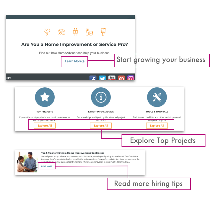
Continue to More Content Links
Observation: Non-contextual links throughout site
Recommendation: Add context to the links
Outcome: Text link writing standard now in place
After a site evaluation, I identified many instances where non-descriptive learn more, show more, etc. links were used. Without giving these links more context the user is not clear on what to expect when clicking on them. Another concern is accessibility. Those who utilize screen readers to navigate a page would have a hard time understanding the context of the links.
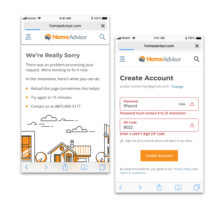
Error Messaging
Observation: Error messages had no standard format lacking in informative help for the user
Recommendation: Use a standard format. Let the user know what happened and how to fix the issue.
Outcome: Error message writing standards are now in place
Tasked with conducting research on error messaging and providing data and literature on standards, I put in place a standard format for error message writing and design.
I have since been asked to write numerous error messages for various design flows and scenarios including 404 and 500 pages.
Education | UX Writers Collective
Overview | Handshake
Handshake is an app that makes it easy for freelancers and business owners to collaborate on projects and manage payments. Through the UX writing case study of Handshake, I was able to learn the methodology, best practices, and main principles of UX writing for digital products.
Content Style Guides | Handshake
One of the best ways to ensure your product remains consistent is by implementing and maintaining a content style guide based on your company’s brand voice and content standards. This helps create a baseline of shared understanding and allows participation and collaboration across teams. I created a content style guide based on research of Handshake’s brand voice and content standard might be.

Tone Mapping | Handshake
A brand’s voice should remain consistent throughout the UI copy. The tone of the brand voice is what will change, based on the situation at hand, and the user’s emotions during different points in their journey. Tone mapping is an exercise to help yourself and your team better understand different tones you can utilize when writing for varying situations in a user’s journey. I found experimenting with tone mapping also helped develop my delivery teams’ empathy for the user in their journey.

Editing | Handshake
In a perfect scenario designing and writing for a product are happening at the same time, yet that is rarely the case. I’m experienced in utilizing best practices and a company’s content style guide to evaluate and edit copy at any stage. These evaluations and edits help consistency and decrease cognitive burden, which leads to higher conversion, and greater retention.

*The edits to the screens are made in a bright pink color to remain easily distinguishable from the rest of the UI.
Recommendations | Handshake

*The edits to the screens are made in a bright pink color to remain easily distinguishable from the rest of the UI.
Conversational Language | Handshake
Part of Handshake’s brand voice guideline states the writing should feel friendly and conversational. This helped give the product a less robotic feel. Here is an example of conversational vs. non-conversational copy.

Onboarding Copy | Handshake
To help users onboard within Handshake I wanted to remain consistent with the conversational, respectful, and informative characteristics of the brand’s voice. At this point in the user journey, the tone should reflect Handshake’s cheerful and encouraging dimensions.


Outcome
Practicing UX writing methods and creating consistent products has proved beneficial in increasing the effectiveness of my designs, and efficiency in my workflow. I’m now able to make evaluations and recommendations based on best practices and testing. The Handshake app was a good challenge as it involved keeping in mind two user groups while designing the copy for the product.